

CMYK vs RGB, ICC Profiles, and Color Management seem like black box topics. We hope to begin demystifying practical color theory to help dial in your design intent!
So why the brick oven with the pizza image? Color management has more similarities to ovens than you might have thought.
Imagine your favorite recipe, the one that always garners praise. You’re familiar with every ingredient and the precise way to blend them. Now, picture attempting to recreate this dish in an unfamiliar kitchen (a different space), only to find the results somewhat off.
This scenario mirrors the nuances of working with color.
(Also known as ICC Profiles)
Expanding on our culinary metaphor, envision color spaces as various types of ovens. While your files (or ingredients) remain the same across different color spaces or ICC profiles, the way each ‘bakes’ your color can alter its final appearance. These spaces were established to create a common language of color across diverse devices.
Though there are numerous color spaces, within Nonstop Printing and broadly in the industry, we often focus on four key profiles. While Adobe defaults to SWOP v2 and sRGB, these older profiles restrict our color range. Conversely, Gracol 2013 and Adobe RGB expand our color capabilities, enhancing brightness, shadow detail, and overall color depth.
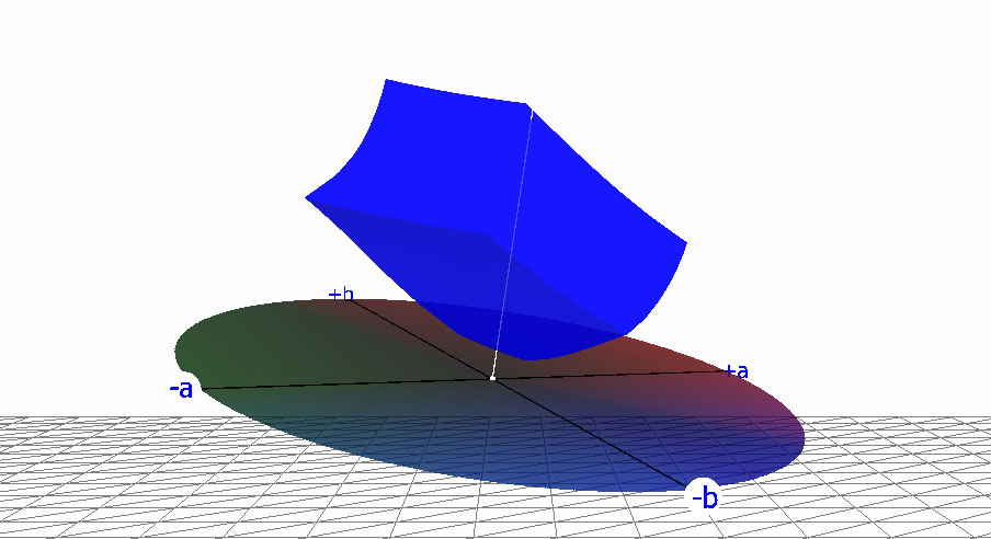
Default for Adobe programs. It’s not good because we can produce a wider range of color than this.
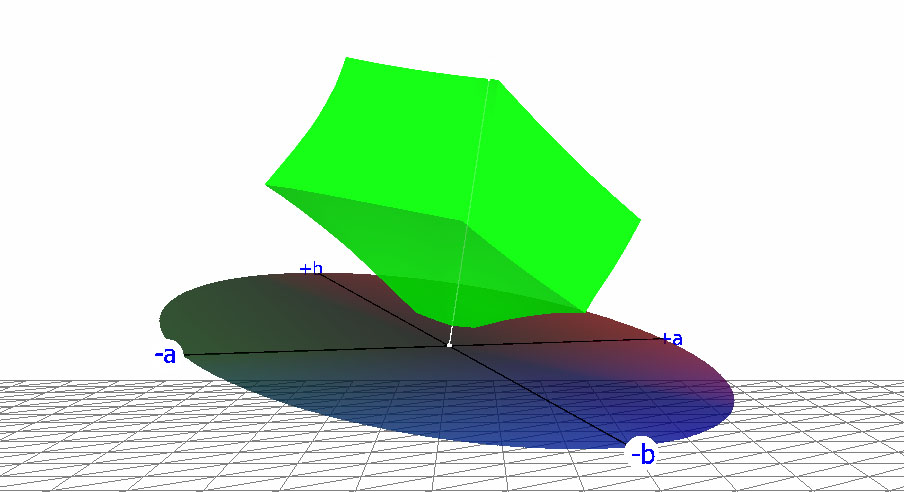
It’s the closest color space that our printing devices can produce.
Nonstop Printing targets this ICC Profile for CMYK elements.
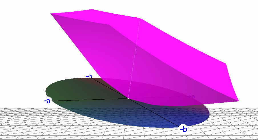
Default for most programs including Adobe programs. It’s not great. In some areas of the color space, we can produce a wider range of color than sRGB.
Nonstop can target this since it’s the most common setting images are designed with.
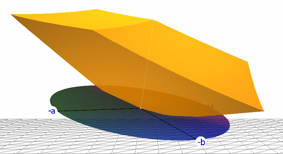
It’s the largest color space that most printers recognize. It more than covers the colors we’re able to produce (even more than most monitors).
This is the ideal target for RGB elements. You can get the best of both worlds. Bright colors and difficult shadow detail.
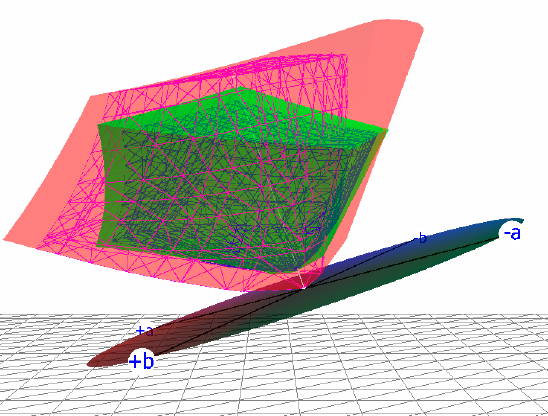
Different objects and machines can produce varying ranges of color. In printing, creating red, green, and blue inks to replicate monitor colors isn’t feasible due to the fundamental difference in light sources: inks require external light to be visible, whereas monitors generate their own light.
Furthermore, even within the CMYK spectrum, the specific shades of each color can vary significantly from one manufacturer to another. For instance, cyan produced by one company might appear brighter than cyan from another, impacting the overall color range a device can reproduce.
When looking at the four color spaces together, it’s tricky to figure out how colors should be interpreted when they exist in one space but not in another. This is where specialized software comes into play. We use a tool called GMG, crafted by experts in Germany, to help us tackle these complexities.
Although this tool is adept at adjusting colors within the limitations of a given color space, it cannot create colors outside of that space’s capabilities. However, you can use a technique known as “Assigning” color profiles to alter how colors are perceived, akin to adjusting the settings on an oven to achieve the perfect bake.
Here’s a quick example using photoshop and you can do this with any image. I have an image below with the original “kind” of color (sRGB.icc) and I took an eyedropper to measure the RGB values of the orange wall.
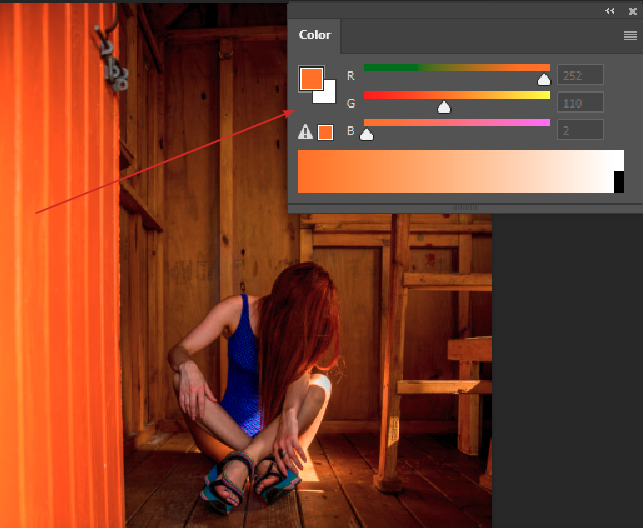
Below, we showcase the same image with identical RGB values, yet we’ll shift its ICC Profile to demonstrate the impact of different color interpretations.
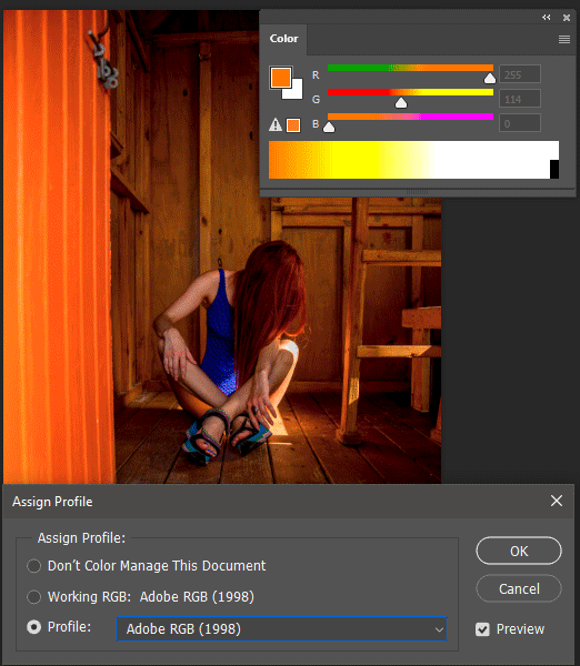
This is something you can explore too. In Photoshop, you can reassign an image’s color profile by navigating to Edit and selecting “Assign Profile.”
Prepare to be astonished by the transformations below. The visual changes highlight the profound effect of altering the ICC Profile, underscoring the importance of choosing the right color settings for your project.
Don’t sweat it. Adobe programs and others default to a safe, but limited color space. At Nonstop Printing, we’ve boiled it down so that many of our clients don’t modify their settings at all, yet still achieve more predictable color.
RGB = sRGB
CMYK = SWOP V2We always mention both CMYK and RGB elements because in PDF documents, you can have both within the same file.The sad thing is that these defaults throttle the color range of your images.
RGB = you can choose either sRGB or Adobe RGB 1998
CMYK = we only target Gracol 2013 CRCP6. It’s very similar to Coated Gracol 2006.
We do this regardless of what your file is tagged because too many files aren’t tagged correctly. To gain the most control, you’ll want to design with these profiles for the best color predictability.
At Nonstop Printing, the most ideal combo for the most color range is Adobe RGB 1998 for RGB elements and Gracol 2013 CRCP6 for CMYK elements.
Most people don’t. For now, do NOT convert your print files to CMYK. If you’re working with us on your project, send us your files as is and we’ll provide feedback if necessary.
We may develop some practical courses. Let us know on our quote form if you want additional help! Here are the general steps:
We’ll help demystify the print process so you can choose the best method for your project.
Open for scheduled visits 11 am – 5pm Monday – Friday
info[at]nonstopprinting.com | 323.464.1640
© Nonstop Printing, Inc. 6226 Santa Monica Blvd. Los Angeles, CA 90038
We use cookies to ensure you get the best experience on our website. By continuing, you accept our use of cookies.